Entries Tagged 'design' ↓
November 23rd, 2008 — art, design, software, trends
I was 5 years old in 1977, and all-in-all, I’d say the aesthetics of the day made a big impression on me. Here are some of the things that, looking back on it 31 years later, seem to share a common visual language and which were most influential on the next 10 years in movies, computing, games, and package design.

The rich colors and ground-breaking special effects of Spielberg’s 1977 Close Encounters of the Third Kind marked the beginning of a new era in filmmaking and ultimately set a goal for computer graphics and video games. The nascent digital graphics industry was barely capable of producing color “high-res” graphics, but folks knew that when they could, these were the kinds of graphic effects they wanted to make.


Maybe it’s just me, but it seems to me that Close Encounters, Atari, Space Invaders, and Star Wars were all linked together with a common visual sense. I think it’s pretty obvious that Atari ripped off Close Encounters for the Space Invaders packaging.

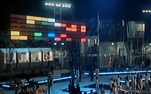
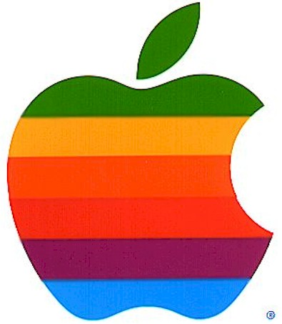
Likewise, the colorful “light organ” used to communicate with the aliens in Close Encounters is a close cousin, visually, to the famous Atari game Breakout. Steve Jobs was one of the designers of the arcade version of Breakout. Note the similarity to the original “rainbow” Apple logo.


Computer-generated music and sound was still in its very earliest stages, but the simple John Williams melody put to such brilliant use in Close Encounters was the sort of musical coda that aspiring game designers and programmers could latch onto and reproduce. John Williams of course scored hit after hit in movie soundtracks, but the Close Encounters and Star Wars themes of 1977 were hugely influential.
Spielberg used the Rockwell International logo (center) to clever aesthetic effect in Close Encounters; contractors at the secret military base at Devil’s Tower sported it, visually quoting the Devil’s Tower landscape. Of course, it’s interesting to note how similar the logos are for Atari, Rockwell, and Motorola – all major corporations of the day.


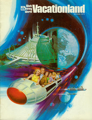
Disney got into the act in 1977 with the opening of Space Mountain. While they may not have been directly influenced by imagery from Close Encounters, Atari, or Star Wars, it’s clear that the popular imagination was drawing from common influences like Kubrick’s 2001: A Space Odyssey from 1969.
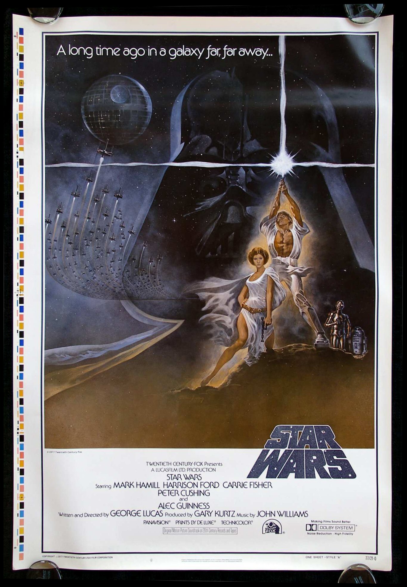
Of course the biggest influence of 1977 was George Lucas’ seminal work, Star Wars, which interestingly was not initially marketed using its iconic title graphics in its movie poster. It took a little while, and for the film to settle into its status as an international blockbuster, for it to adopt the visual marketing language that would become familiar in the release of the subsequent films in the series.


Arguably, the latter sans-serif Star Wars bubble letters were more inline with the iconography of Close Encounters, Atari, and the other major visual influencers of 1977. I’d bet the previous, blockier Star Wars graphic was designed in 1975 or 1976, before the film and its title graphics were completed. And the very earliest Star Wars art from the 1973-1974 timeframe used a hand-drawn serifed font — a different look altogether.


The dirty, realistic “used universe” designed for Star Wars was also influential. Unlike previous science fiction and space films, Lucas imparted his universe with a lived-in, beat-up look that added a romantic touch of decay to an imagined future — or past.

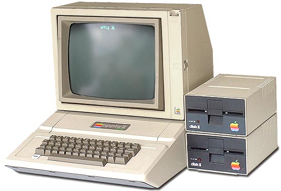
The Apple ][ was a direct result of Jobs’ (and Wozniak’s) work on Breakout, and the color graphics circuitry has much in common. And I don’t think it’s any stretch to say that the generation of Silicon Valley idealists that designed the Apple ][ and Atari 800 were hugely influenced by the blockbuster science fiction films of the day. While the early Apple designs lacked sufficient economy of scale or budget to have a very “designed” aesthetic, the Apple II does look like something straight out of the Star Wars universe. And the ugly Disk ][ and portable monitor are things that just didn’t get attention yet. Maybe they’re dirty, lived-in artifacts of a galaxy far, far away?

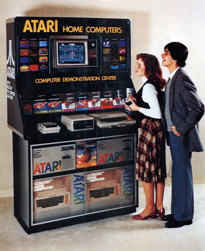
Atari, on the other hand, with the success of the 2600 VCS and its computers, had fully embraced the 1977 aesthetics and by 1980 had full color graphic packaging and a line of “Star Wars” compliant peripherals. And the packaging for the programs borrowed from movie poster designs.

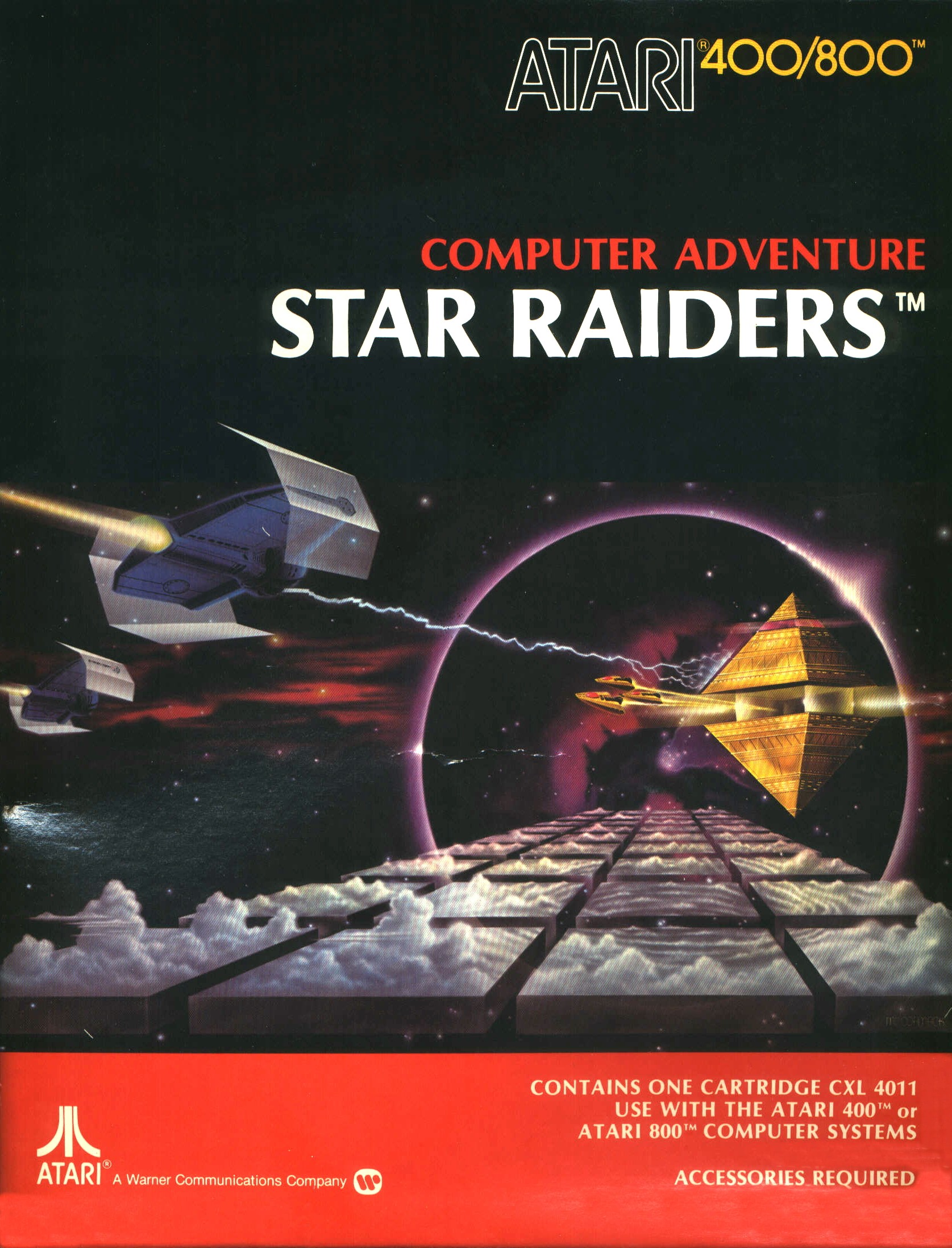
Quite clearly Star Raiders (1979) borrowed directly from Star Wars. In fact, looking at this graphic, I’m now surprised that Atari didn’t get a phone call from Lucas. I guess this was back in the day before tie fighters were Tie FightersTM.
Media critics have argued that Star Wars and Close Encounters of the Third Kind marked the start of the era of blockbuster films, and a general shift in popular culture away from smaller, more thoughtful cinema and towards a populist, anti-intellectual approach in art and film in particular.
Whether that’s true or not, I think it is fair to say that 1977 did mark the year of a seismic shift in aesthetics that has been felt all the way through today in computing, gaming, film, and product packaging. Perhaps 1977 is a kind of bright-line marker for popular art — before and after seem to be from entirely different eras.
The fact that I’ve spent most of my life selling products or working in technologies directly influenced by this powerful aesthetic sense is likely no coincidence: to be young in 1977 was to be indelibly marked by the look and feel of a new era.
November 21st, 2008 — art, business, design, economics, iPhone, mobile, programming, software, trends, visualization
At Xerox Parc in the 1970’s, Alan Kay fostered the innovations that form the foundation of modern computing. Windowing, mice, object oriented languages, laser printing, WYSIWYG, and lots of other stuff we take for granted today either had its start or was fleshed out at Xerox Parc.
The venerable mouse, which enabled direct manipulation of content on the screen, was just one of a few innovations that was screen-tested as a possible heir to the venerable cursor and text terminal metaphor which had predominated since the dawn of computing.
Mice, trackballs, light pens, tablets, and Victorian-looking headgear tracking everything from brainwaves to head and eye movements were all considered as the potential input devices of the future. No doubt there were other metaphors besides windows considered as well. Hypercard, anyone?
Steve Jobs, by selecting the mouse as the metaphor of choice for the Lisa and subsequent Macintosh computers, sealed the deal. Within a year, Bill Gates, by stealing the same design metaphor for use in Windows 1.0, finished the deed. By 1986, the mouse was a fait accompli.
Since the dawn of the Mac and Windows 1.0, we’ve taken for granted the notion that the mouse is and will be the primary user interface for most personal computing and for most software.
However, computing is embedded in every part of our lives today, from our cell phones to our cars to games and zillions of other devices around the house, and those devices have myriad different user interfaces. In fact, creating new user experiences is central to the identity of these technologies. What would an iPhone be without a touch screen? What would the Wii be without its Wiimotes? What, indeed, is an Xbox 360 but a PC with, uh, lipstick and a different user interface metaphor?
(An aside: How awesome would it be if the iPhone, Wii, and Xbox 360 all required the use of a mouse? People fidgeting on a cold day, taking out their iPhone, holding it in their left hand, plugging in their mouse, working it around on their pants to make a call. Kids splayed out on the rumpus room floor, mousing around their Mario Karts. Killer, souped up force-feedback mice made just for killing people in Halo. Mice everywhere, for the win.)
So, what’s with the rant? Simply that the web has taken a bad problem — our over-reliance on mice — and made it even more ubiquitous than it was in the worst days of windowing UI’s.
“And then if you click here…”
No, here — not over there. Click here first. Scroll down, ok, then click submit. Now click save.
See the problem? The reliance on the mouse metaphor on the web is fraught with two hazards.
- Mice require users to become collaborators in your design.
- Each user only brings so much “click capital” to the party.
Catch My Disease
We’ve all had the experience of using a site or app that requires a great deal of either time or advance knowledge to fully utilize.
You know the ones — the ones with lots of buttons and knobs and select boxes and forms just waiting for you to simply click here, enter the desired date, choose the category, then get the subcategory, choose three friends to share it with, then scroll down and enter your birthdate and a captcha (dude) and then simply press “check” to see if your selection is available for the desired date; if it is, you’ll have an opportunity to click “confirm” and your choice will be emailed to you, at which point you will need to click the link in the email to confirm your identity, and you’ll be redirected back to the main site at which point you’ll have complete and total admin control over your new site. Click here to read the section on “Getting Started”, and you can click on “Chat with Support” at any time if you have any questions.
What the hell do these sites want from you?
If these sites are trying to provide a service, why do they need you to do so much to make them work? Sure, some stuff is complex and requires information and processes and steps to empower them, but when you ask users to participate too much as key elements in your design, you create frustration, resentment, and ultimately rage. That’s cool if that’s your goal, but if you’re trying to get happy users, you’ve done nothing to advance that cause. So, it shouldn’t be about “all you have to do is click here and here.” Ask less of your users. Do more for them. Isn’t that what service is all about?
Limited Click Capital
Sometimes, people just want to be served ��— even entertained or enchanted. They don’t want to become the slavish backend to a maniacal computer program that requires 6 inputs before it can continue cialisviagras.com. Is the user in service of the computer, or is the computer serving the user? I always thought it was the latter.
I’ll never cease to be instructed by the lessons learned from developing my sites Twittervision and Flickrvision. Both sites do something uncommon — they provide passive entertainment, enchantment, and insight in a world where people are asked to click, select, participate, scroll, sign up, and activate. It’s sit back and relax and contemplate, rather than decipher, decide and interact. Surely there are roles for both, but people are so completely tired of deciphering, that having a chance to simply watch passively is a joyful respite in a world of what is mostly full of badly designed sites and interactions. This alone explains their continued appeal.
People come to sites with only so much “click capital,” or willingness to click on and through a site or a “proposed interaction.” This is why site bounce rates are usually so high. People simply run out of steam before they have a chance to be put through your entire Rube Goldberg machine. Make things easier for them by demanding fewer clicks and interactions.
Make Computing Power Work For Your Users
Truism alert: we live in an age with unprecedented access to computing power. What are you going to do with it? How are you going to use it to enchant, delight, and free your users? Most designs imprison their users by shackling them to the design, turning them into nothing more than steps 3, 6, 8, 9, and 11 of a 12 part process. How are you going to unshackle your users by making them — and their unfettered curiosity — the first step in a beautiful, infinitely progressive algorithm?
Predict and Refine
Forms and environments that rely on excessive interaction typically make one fatal assumption: that the user knows what they want. Most users don’t know what they want, or they can’t express it the way you need to know it, or they click the wrong thing. Remove that choice.
Do your best to help your users along by taking a good guess at what they want, and then allow them to refine or steer the process.
Remember, you’re the one with the big database and the computers and the web at your disposal: how are you going to help the user rather than asking the user to help you? You’re advantaged over the user; make it count for something.
Don’t Think About Mice
Mice lead to widgets. Widgets lead to controls. Controls lead to forms. Forms lead to hate. How are you going to break free from this cycle and give your users something compelling and useful with the minimum (and most appropriate) interaction? What is appropriate interaction?
It depends. What if you rely on gestures, or mouseovers, or 3 yes or no questions in big bold colors? That’s minimal and simple. It may be just what you need to empower your idea and serve your users.
I’ve been working with the WiiMote and the iPhone a lot lately, and trying to use touch screens, accelerometers, and the Wii’s pitch and roll sensors to create new kinds of interaction. Maybe this is right for your work.
Think about it and don’t assume traditional mouse/web/form interactions. Sure, sometimes they are the right and only tool for the job, but if you want to stand out and create compelling experiences, they surely can no longer be the central experience of your design.
Long Live the Cursor
Back in the early days of GUIs, there were lots of people who contended that no serious work would ever get done in a window and that the staple of computing and business would be the DOS metaphor and terminal interactions. There have been dead-enders as long as there have been new technologies to loathe. I’m sure somewhere there was a vehement anti-steel crowd.
The mouse, the window, and HTML controls and forms are the wooden cudgels of our era — useful enough for pounding grain, but still enslaving us in the end. How will you use the abundance of computing power, and new user interface metaphors to free people to derive meaning and value?
November 12th, 2008 — art, design, economics, mobile, programming, social media, software, travel, trends, visualization

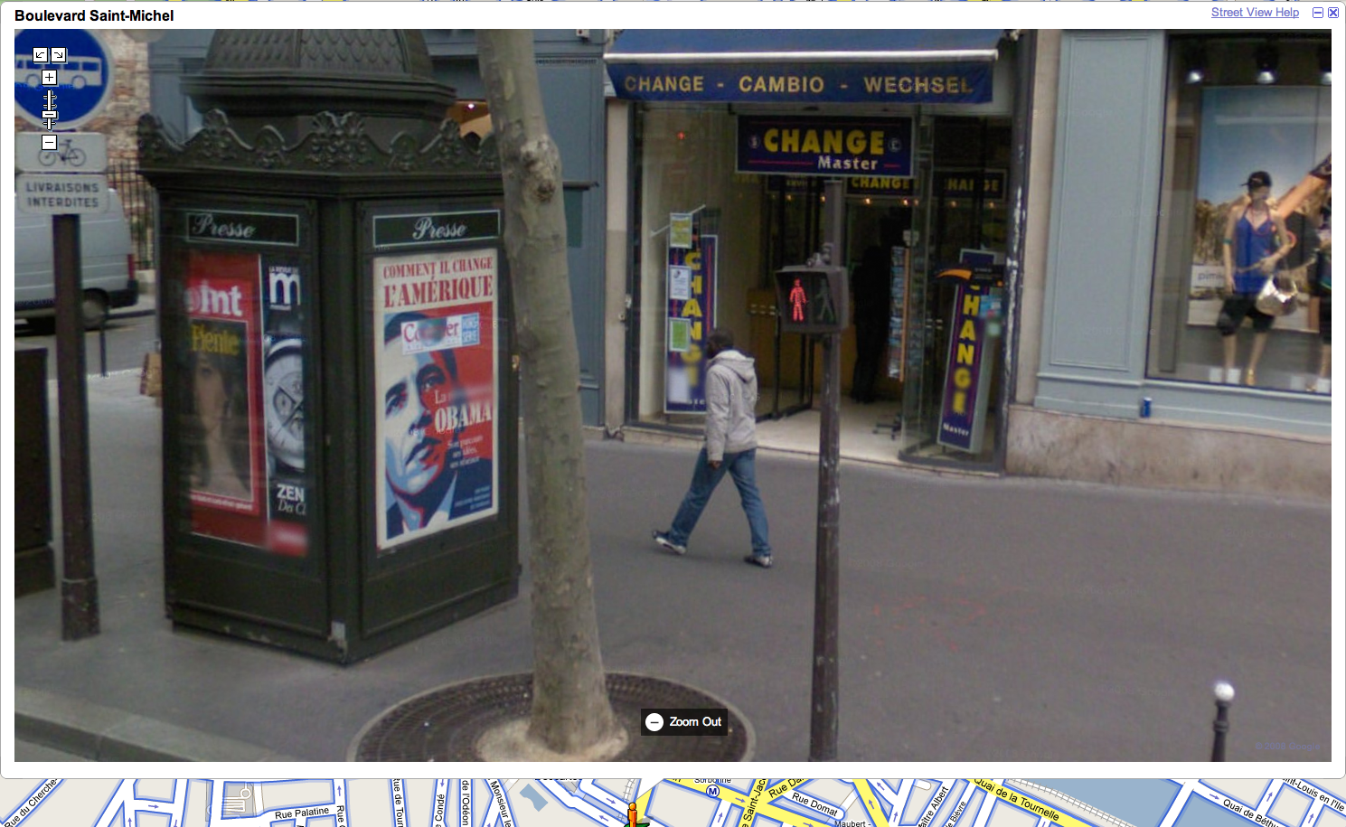
Boulevard St. Michel, Paris, Google Streetview
So many wonderful things going on in this photo, and it’s all entirely unintentional. With such a vast quantity of visual data collected for Google Streetview, how many “artistic” scenes lurk within it? How might one build a machine for finding the art within this dataset? Can it be crowdsourced?
Want to work on this with me? If so, ping me.
November 10th, 2008 — baltimore, design, economics, social media, trends
In the circles I move in, there’s been a lot of discussion lately about Starfish and Spiders; reference to the 2006 book by Ori Brafman and Rod Beckstrom.
The idea behind the book, which I have not read (why should I have to fund these guys just to understand their point), is that top-down command and control style organizations resemble a spider, and that if the head of the spider is removed, the organization dies.
A starfish organization, in contrast, can survive damage, and in fact after one of its arms is severed can not only repair the arm, but the severed arm can re-grow a new body. Nice enough analogy, and good for getting the point across to thick-skulled CEO’s still mourning the apparent loss of their cheese.
However, I find the analogy a bit weak; the “starfish” concept doesn’t actually explain a lot of the behavioral properties that underlie “starfish” organizations. Folks in the coworking community rightly believe that it is a starfish-style movement: leaderless and self-healing.
Flocking behavior (as seen with birds and insects) is a more instructive analogy to me. On first glance, many naïvely assume that flocks follow a leader. Not true. Individual members of a flock obey just three simple rules, and this is all that’s required to produce complex flocking behavior:
- Separation: Steer to avoid crowding local flockmates
- Alignment: Steer towards the average heading of local flockmates
- Cohesion: Steer to move towards the average position of local flockmates
Quoting from Wikipedia (so it must be true), “In flocking simulations, there is no central control; each bird behaves autonomously. In other words, each bird has to decide for itself which flocks to consider as its environment. Usually environment is defined as a circle (2D) or sphere (3D) with a certain radius (representing reach). A basic implementation of a flocking algorithm has complexity O(n2) – each bird searches through all other birds to find those who falls into his environment.”
The implementation of coworking is flock-like. The spread of coworking is starfishy.
The reason why so many people have trouble defining coworking is because it defies centralized control, or the notion of a flock leader. The reason why people say, “the only way to understand coworking is to do it,” is because it is fundamentally a flocking behavior which relies on individual execution of the flocking algorithm rules.
Flocking also explains why so many coworking environments end up selecting for the right people, with no defined rules or central control; each bird chooses whether the environment is right for her. The flock self selects.
So, if you’re having trouble explaining why your local coworking group has anything to do with starfish, maybe it’s time to start talking about your flock instead.


