I was 5 years old in 1977, and all-in-all, I’d say the aesthetics of the day made a big impression on me. Here are some of the things that, looking back on it 31 years later, seem to share a common visual language and which were most influential on the next 10 years in movies, computing, games, and package design.
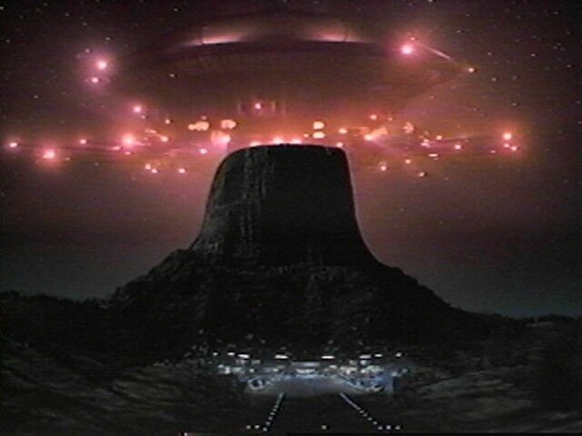
The rich colors and ground-breaking special effects of Spielberg’s 1977 Close Encounters of the Third Kind marked the beginning of a new era in filmmaking and ultimately set a goal for computer graphics and video games. The nascent digital graphics industry was barely capable of producing color “high-res” graphics, but folks knew that when they could, these were the kinds of graphic effects they wanted to make.


Maybe it’s just me, but it seems to me that Close Encounters, Atari, Space Invaders, and Star Wars were all linked together with a common visual sense. I think it’s pretty obvious that Atari ripped off Close Encounters for the Space Invaders packaging.

Likewise, the colorful “light organ” used to communicate with the aliens in Close Encounters is a close cousin, visually, to the famous Atari game Breakout. Steve Jobs was one of the designers of the arcade version of Breakout. Note the similarity to the original “rainbow” Apple logo.

![]()
Computer-generated music and sound was still in its very earliest stages, but the simple John Williams melody put to such brilliant use in Close Encounters was the sort of musical coda that aspiring game designers and programmers could latch onto and reproduce. John Williams of course scored hit after hit in movie soundtracks, but the Close Encounters and Star Wars themes of 1977 were hugely influential.
 |
||
 |
||
Spielberg used the Rockwell International logo (center) to clever aesthetic effect in Close Encounters; contractors at the secret military base at Devil’s Tower sported it, visually quoting the Devil’s Tower landscape. Of course, it’s interesting to note how similar the logos are for Atari, Rockwell, and Motorola – all major corporations of the day.
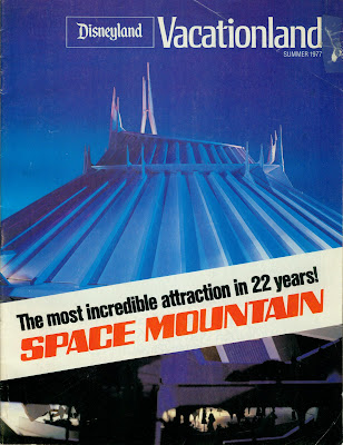
Disney got into the act in 1977 with the opening of Space Mountain. While they may not have been directly influenced by imagery from Close Encounters, Atari, or Star Wars, it’s clear that the popular imagination was drawing from common influences like Kubrick’s 2001: A Space Odyssey from 1969.
Of course the biggest influence of 1977 was George Lucas’ seminal work, Star Wars, which interestingly was not initially marketed using its iconic title graphics in its movie poster. It took a little while, and for the film to settle into its status as an international blockbuster, for it to adopt the visual marketing language that would become familiar in the release of the subsequent films in the series.
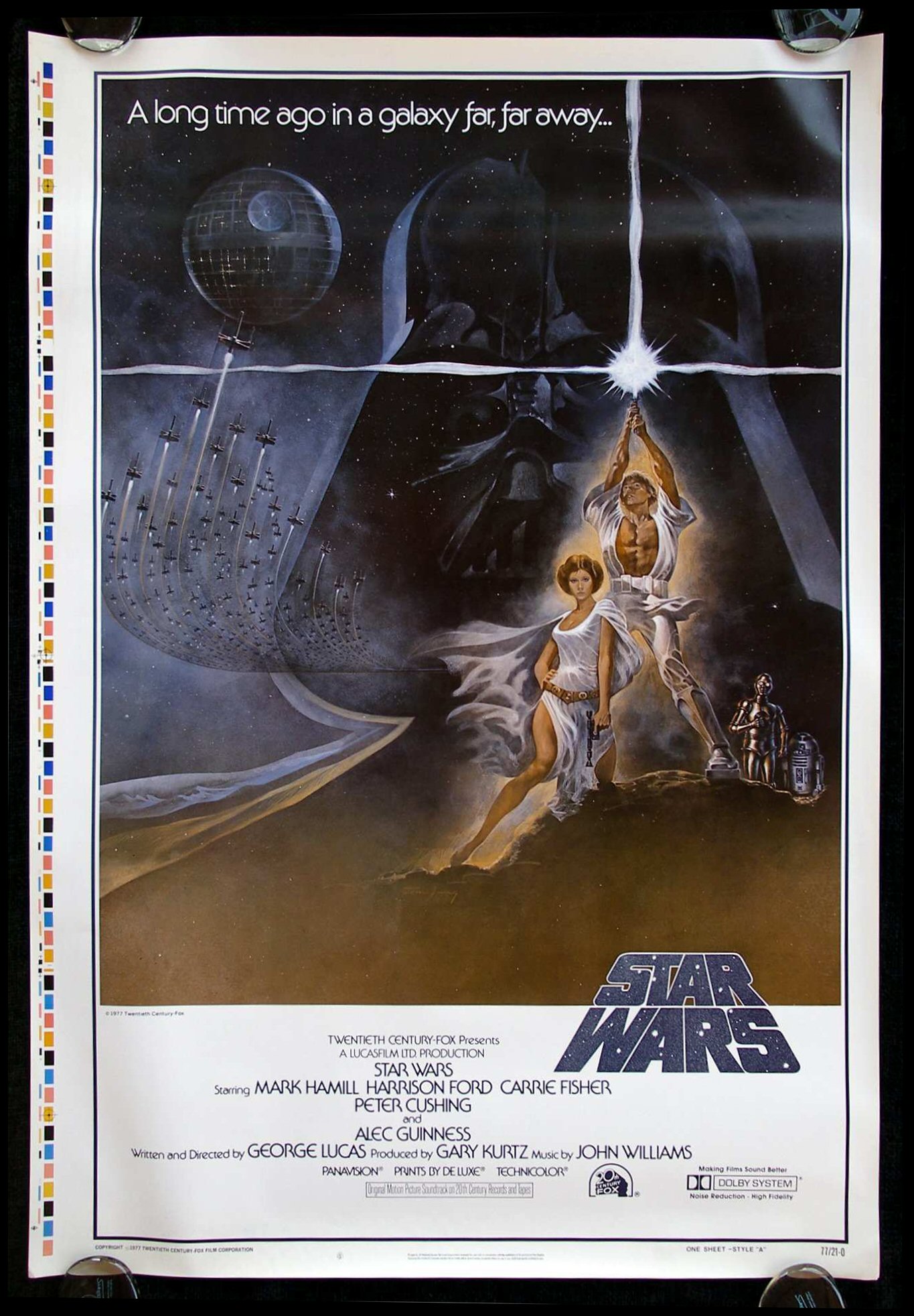
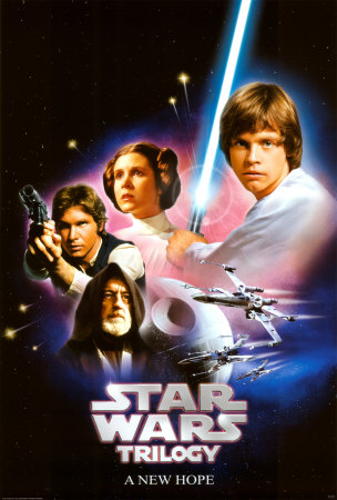
Arguably, the latter sans-serif Star Wars bubble letters were more inline with the iconography of Close Encounters, Atari, and the other major visual influencers of 1977. I’d bet the previous, blockier Star Wars graphic was designed in 1975 or 1976, before the film and its title graphics were completed. And the very earliest Star Wars art from the 1973-1974 timeframe used a hand-drawn serifed font — a different look altogether.


The dirty, realistic “used universe” designed for Star Wars was also influential. Unlike previous science fiction and space films, Lucas imparted his universe with a lived-in, beat-up look that added a romantic touch of decay to an imagined future — or past.
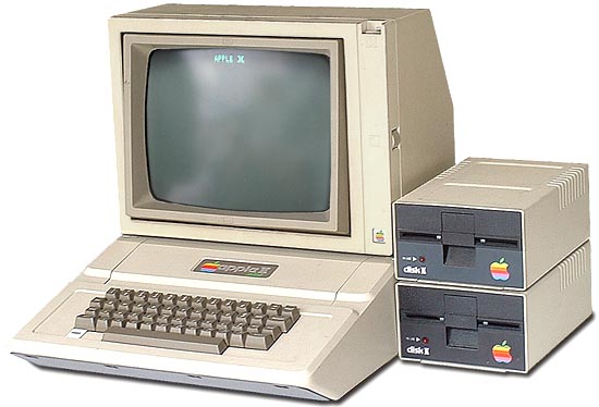
The Apple ][ was a direct result of Jobs’ (and Wozniak’s) work on Breakout, and the color graphics circuitry has much in common. And I don’t think it’s any stretch to say that the generation of Silicon Valley idealists that designed the Apple ][ and Atari 800 were hugely influenced by the blockbuster science fiction films of the day. While the early Apple designs lacked sufficient economy of scale or budget to have a very “designed” aesthetic, the Apple II does look like something straight out of the Star Wars universe. And the ugly Disk ][ and portable monitor are things that just didn’t get attention yet. Maybe they’re dirty, lived-in artifacts of a galaxy far, far away?
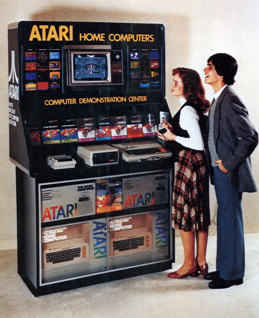
Atari, on the other hand, with the success of the 2600 VCS and its computers, had fully embraced the 1977 aesthetics and by 1980 had full color graphic packaging and a line of “Star Wars” compliant peripherals. And the packaging for the programs borrowed from movie poster designs.
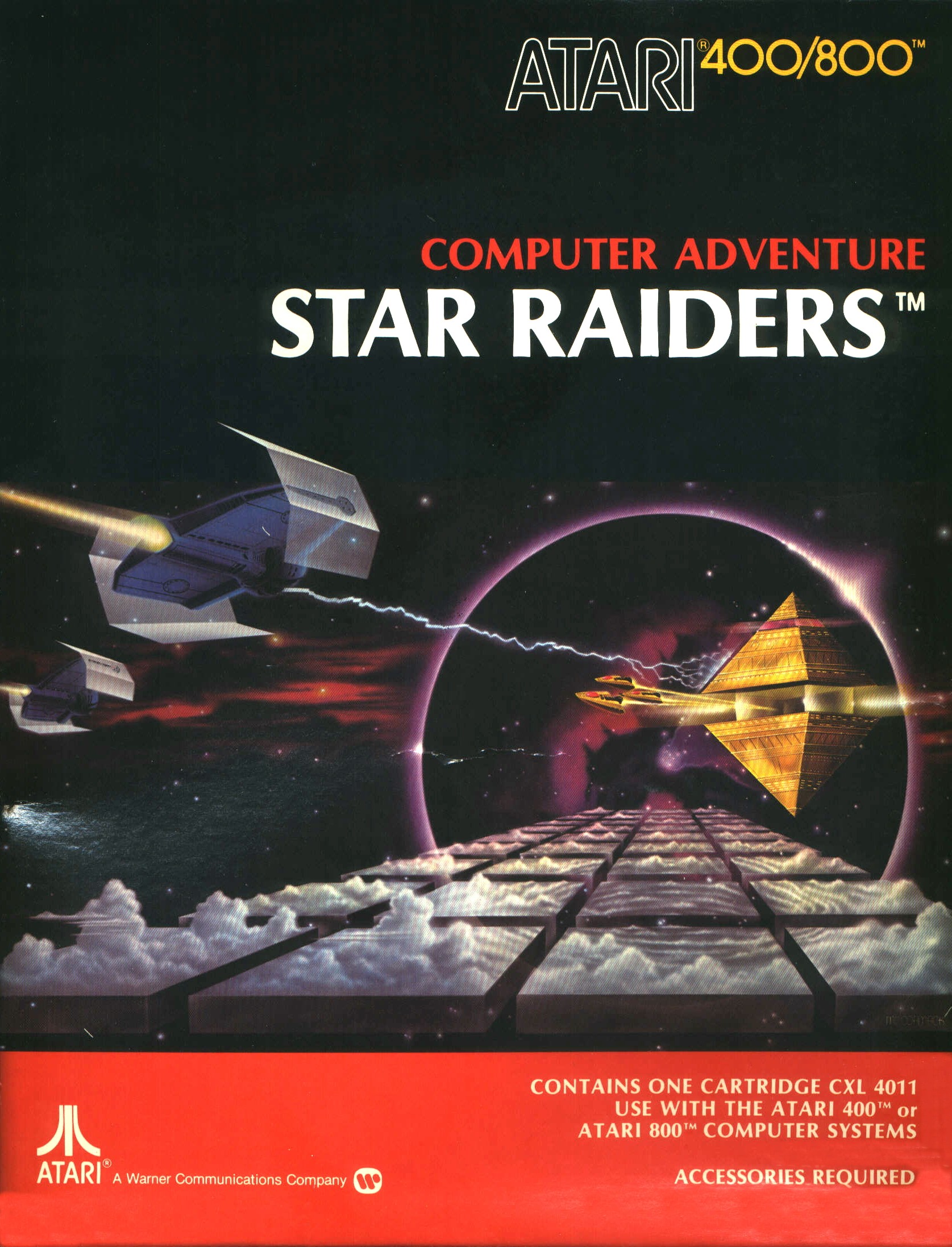
Quite clearly Star Raiders (1979) borrowed directly from Star Wars. In fact, looking at this graphic, I’m now surprised that Atari didn’t get a phone call from Lucas. I guess this was back in the day before tie fighters were Tie FightersTM.
Media critics have argued that Star Wars and Close Encounters of the Third Kind marked the start of the era of blockbuster films, and a general shift in popular culture away from smaller, more thoughtful cinema and towards a populist, anti-intellectual approach in art and film in particular.
Whether that’s true or not, I think it is fair to say that 1977 did mark the year of a seismic shift in aesthetics that has been felt all the way through today in computing, gaming, film, and product packaging. Perhaps 1977 is a kind of bright-line marker for popular art — before and after seem to be from entirely different eras.
The fact that I’ve spent most of my life selling products or working in technologies directly influenced by this powerful aesthetic sense is likely no coincidence: to be young in 1977 was to be indelibly marked by the look and feel of a new era.

5 comments ↓
CEot3k greatly influenced me as a teenager. Aside from the great graphics and soundtrack what sticks in my mind is how the various characters are “called” and travel to the site, as the “chosen few”. So now the internet and technology calls to us and we respond to our niches, barcamps, wherecamps etc… wow has it been 30 years!
I want to go back to selling Star Raiders carts again!
Thanks Dave, for making me feel old. That and when I saw that it’s been 25 years since The Right Stuff came out (the same year I got the Percom disk drive for christmas!) I started to look to see if I was receiving Social Security yet!
Good to hear from you Ray! If you are working in Baltimore we should get together some afternoon! I know, it’s been a *long* time since the 8 bit days. Is this our 30th year in computing? 🙂
Actually I am working in Baltimore right now. Send me an email and we can see what we can do. Btw, happy birthday for yesterday!
Not quite 30th. I did not get the 800 until ’82. Got 4 more years for that one.
“I think it’s pretty obvious that Atari ripped off Close Encounters for the Space Invaders packaging.” No, Atari obviously ripped off the cover art for Boston’s “Don’t Look Back” album 🙂
You must log in to post a comment.