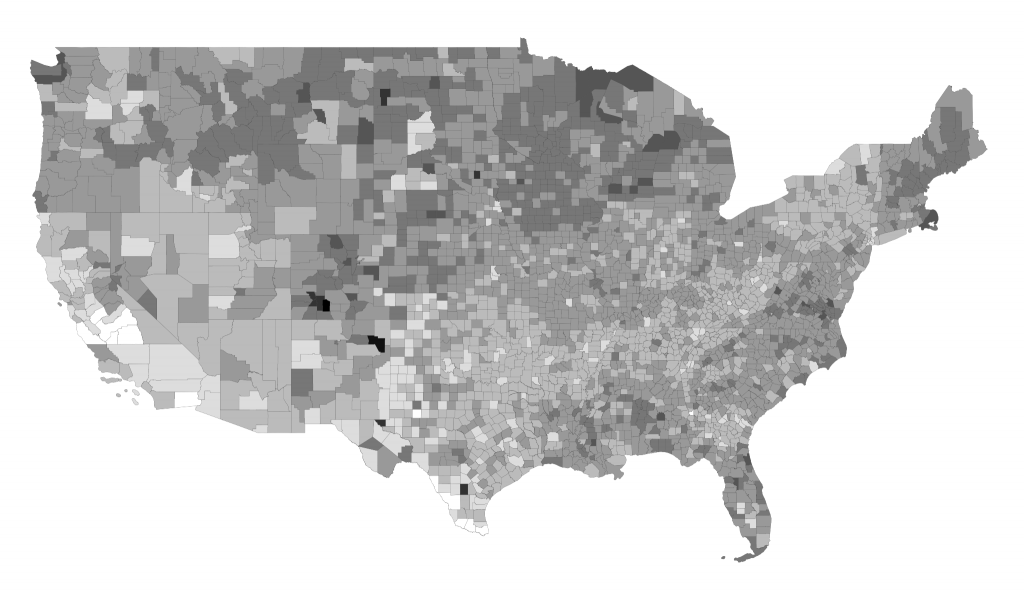
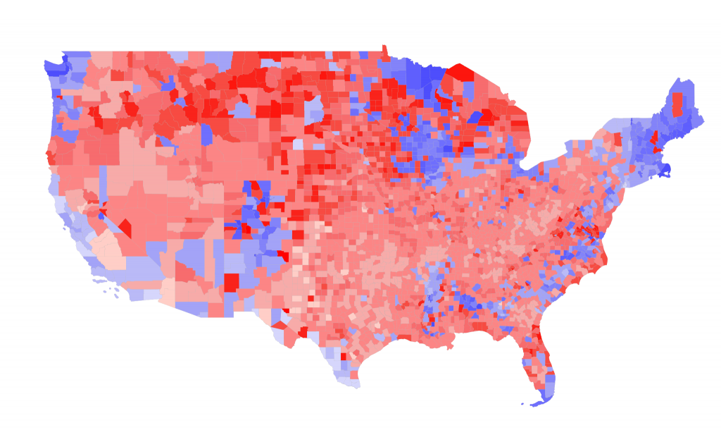
I’ll be writing more about the correlation between population density and voting behaviors, but in the meantime check out these maps showing participation in the 2012 election. (Darker areas voted more than lighter areas.)
So the country voted. Some parts more than others.
What I think is interesting is that much of middle America, particularly in the middle-south, didn’t vote as heavily as people in the north. (The Appalachia/Ozarks belt viagrasstore.net?) California’s central valley also voted pretty lightly.
A few places turned out in BIG numbers (85-90%). Hard to say what might be going on there, but in general I’d say those people are the most annoyed and felt like they needed to vote.
The above map shows turnout by county (indicated by shade); the winner is indicated by color (Red Romney, Blue Obama).
Map created by David Troy using Ruby, Quantum GIS and TileMill. Data sources: Politico Election Results by County, US Census Tiger Shapefiles. May be reproduced with attribution.


3 comments ↓
Might have just been a local issue on the ballot that brought lots of people out to the polls.
Interesting. There’s a really light spot at the bottom of North Dakota that worries me. It’s a reservation. Makes me think they are either disengaged or . Either suggests a problem.disenfranchised
The great lakes had suprising turnout…
You must log in to post a comment.